MLCommons, Website and Grader Report - UX Research and Design
The Problem
MLCommons need to redesign its website and grader reports for its AI safety / risk benchmark (later dubbed “AILuminte”). The previous proof of concept safety benchmark visualizations were confusing and the website did not contain enough information about the benchmark.
Determining the Overall UX Journey
The first thing I did was define the overall UX journey. While this had broad consensus early on, MLCommons draws in volunteers from several organizations, most of whom are not familiar with how its websites are set up and many of whom had not participated in UX research before. I thus created a few example primary paths to demonstrate how the overall UX journey could be presented, and solicited comments.


Setting up a UX Focus Group

I then set up a UX focus group. Since I had not yet establish what would be the user personas, I ensured the focus group members had expertise in different sectors related to AI and relevant to MLCommons: commercial / private, policy and regulatory, research and academia, and civil society. More than 20 people participated as a focus group member. I conducted semi-structured interviews with each member.
Defining User Personas

With the amount of new information that would be published about the benchmark, I knew that splitting content by user personas would be helpful. Based on the semi-structured interviews, I derived possible user persona categories. I then ran a survey with the UX focus group members. Job function was selected since it had a plurality and there was compelling supporting evidence. Note the graph results by category are intentionally masked.

I then ran a second survey and series of card sorts to determine the actual job functions (user personas). This also yielded lists of jobs in each that could be called out in the copy and/or to direct users through the primary path.
Information Architecture and Taxonomy of Content
Bringing all inputs together, I then created a draft information architecture and taxonomy of content. This went through several rounds of feedback. Lastly, I used an Optimal Workshop Treejack study to situate certain content pieces that could go in multiple places or be confusing to users as currently named. Answers with a high consensus told me where to place content. Answers with a split consensus told me to adjust the content placement, name or purpose.


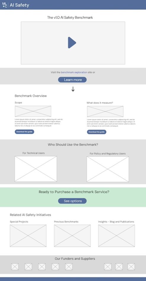
Website Wireframes

Lastly, for the main MLCommons information website, I created a series of wireframes to suggest how the final taxonomy of content should be presented.
Visualizations
For the visualizations, I took the following steps:
- Had the MLCommons grader methodology leads write out the key relationships users should understand. They then proposed visualization ideas for each relationship.
- Created a series of visualizations based on the lead’s ideas and my own ideas. Three examples are below.
- Tested out specific elements, such as the scales and spacing.
- Worked with the web developer team to decide on a visualization library to customize.
- In total, I created seven sets of visualizations, with 17 views.


