Data Visualization Work
A large component of my work was thinking of new and useful ways to visualize existing data to help a USAID health team member think about behavior change.
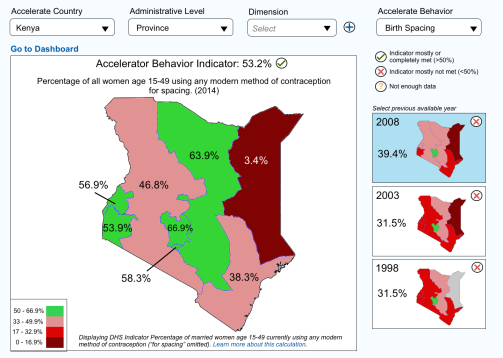
In this example, I used fake data to demonstrate how one of the 18 identified priority behaviors might have changed over time by plotting out the numbers on a geographic map. With this view, staff could then look at why certain counties/provinces in Kenya did well over time and why some lagged behind.
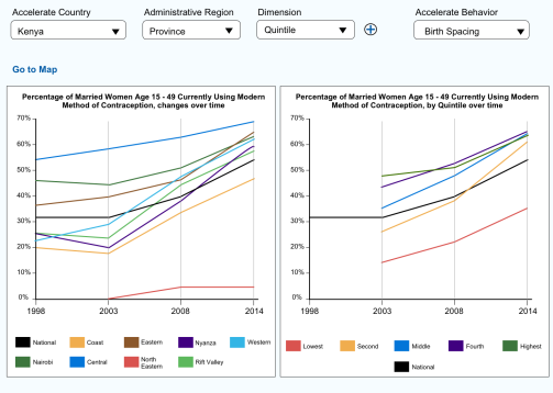
Similarly, another way to view change over time is by USAID’s economic quintiles compared to provinces. In this view, a USAID health team member could quickly see if certain provinces were lagging behind or if the slow progress was due to economic factors. For instance, if Nairobi did not have a significant USAID health program presence in the past few years, their increase a positive behavior change may have happened because the population generally become more wealthy and therefore had better access to existing methods of modern contraception.
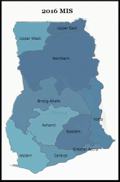
To visualize the time series in another way, I created this chart using USAID’s DHS data, a regional view in Ghana and corresponding yearly quintiles. In this example, we can see that though the Northern Region of Ghana is not the most affluent, its population has one of the highest rates of good malaria prevention practices. In fact, economically poorer populations seem to have higher rates than more affluent populations. This could indicate the programs in the region or targeting those quintiles are working well.
UX Work
Another core function I played in the Accelerate project was to conduct various forms of user testing and to help determine the best user flow of the online tools.
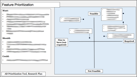
The picture to the right/below is a synthesis of seven detailed user testing sessions in Ghana. The sessions were to determine what functionality to keep in a tool I helped design to allow USAID staff to prioritize among the 18 Accelerate behaviors. The synthesis broke down the functionality by the MosCoW methodology – must, should, could, won’t, as well as on an X-Y axis quadrant view. This analysis served as the basis for the redesign of the tool. Specific feedback has been blurred to comply with NDA restrictions.
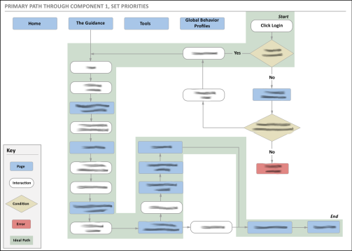
Finally, to combine my data visualization and user experience work on Accelerate, I helped determine the new user flow for USAID health team members to navigate the tools created. The picture to the left/above shows the user flow through a tool to prioritize Accelerator behaviors. Specific information has been blurred to comply with NDA restrictions.

