Sonjara was contracted by the Alliance Française of Washington DC (AFDC) to do a complete redesign of their website, including eCommerce, course registration, placement tests administration and user management. I am the project manager and lead designer for the project. Below is part of the user research I conducted.
Client Research
AFDC makes the majority of their revenue off of the courses they offer. Thus, we knew immediately everything we designed would have to be oriented around course registration.
The first step I took was to connect with the Academic Director and Children’s Director to find out about:
- The staff members themselves
- What they need to do on the website
- Their vision for a successful website
- What worked and what did not work on the current platform(s)
Key Findings
- Having several platforms instead of one consolidated website is a nightmare
- Setting up a new set of classes took forever without a bulk copy
- The only way to update customers with the current system is with a cumbersome slider on the homepage
- Opening sessions and allowing people to choose the right courses never works
User Testing
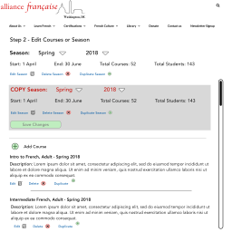

The key findings from the initial client interviews told me immediately that the first step to tackle on the back-end was course management. The two wireframes to the left/above are from a prototype we tested for bulk copying and individual course copying.
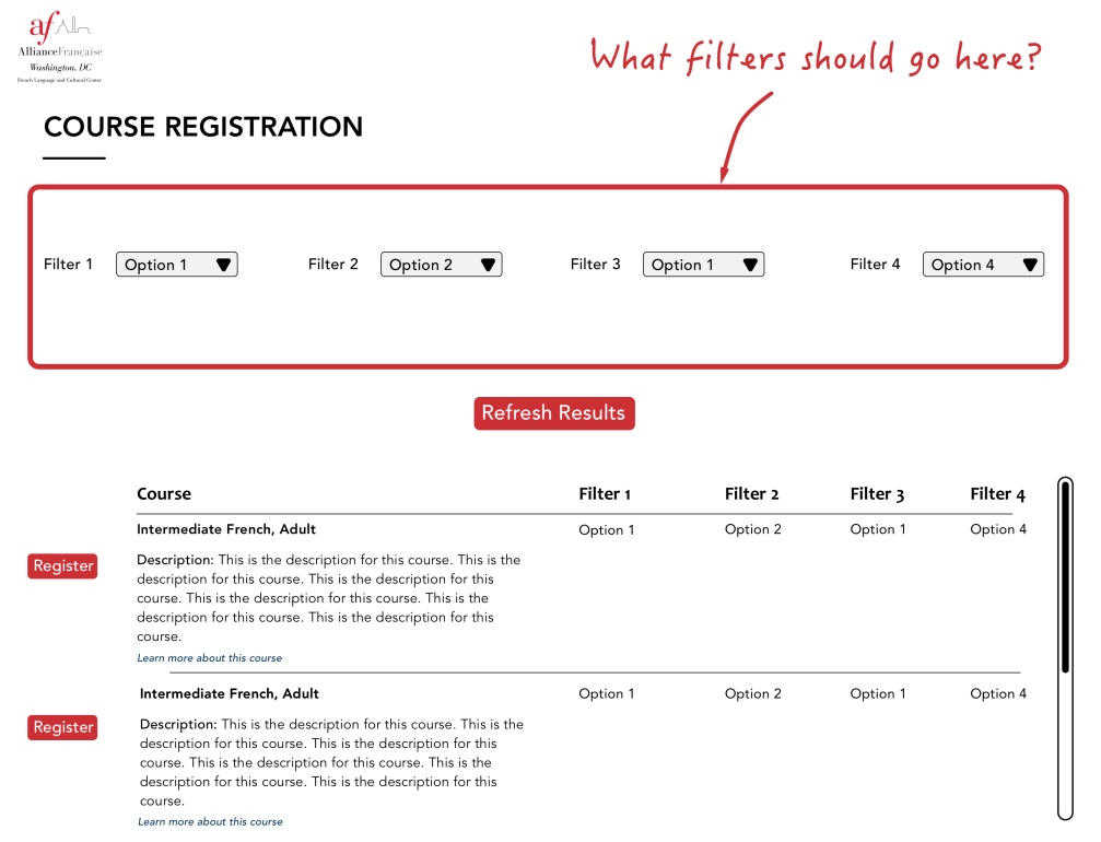
On the front-end, I used three primary methods to test with customers. For the first, I used Optimal Workshop Chalkmark to conduct A/B split tests on specific views:
- Interface of course registration
- Combine vs break out course types that don’t attract many customers
- One vs two buttons on the homepage to start registration process
Finally, the third type of user testing was a semi-structured interview in which I asked participants to go through the following tasks:
- Please click to start your course registration.
- Please select the type of course you want to take or register.
- Please complete the required tasks to sign up for a course.
- Please select the course you want to take or register.
These interviews lent valuable insights into the overall workflow needed for course registration.
User Research Synthesis and Results
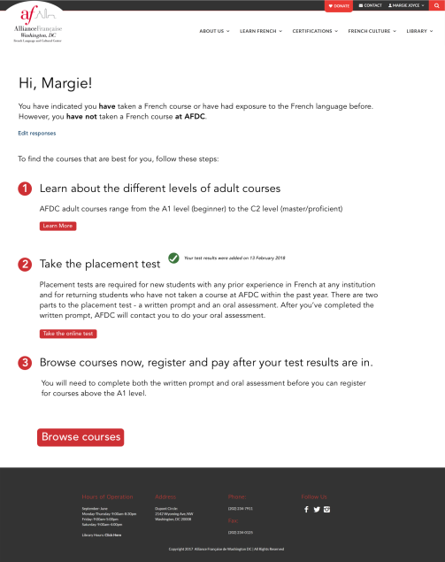
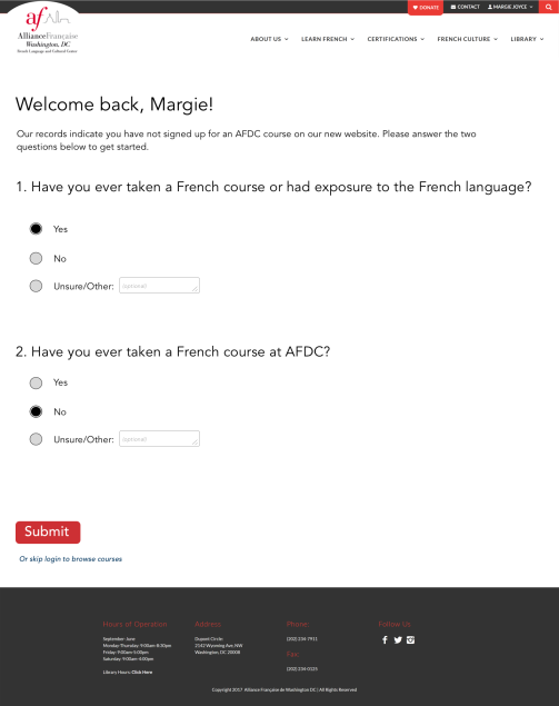
Another improvement I added was to tell customers what questions they need to answer to determine if they should take a placement test before signing up for a course. In the past, many customers would sign up for a beginner course because they thought they didn’t have enough French for anything more advanced. They then realized that the course they selected was too basic.
Asking these two questions on the interface not only helps customers know when to sign up for a test, it helps AFDC place customers.
Primary Paths
As with any comprehensive platform, we have taken careful consideration to design around our primary paths. A few samples are below.
Launch
The new site was launched in July 2018, in time for fall course registration. Our work was validated with the highest number of registered students in more than seven years and the highest enrollment of any AF in the United States! Click here to see the new Alliance Française of Washington DC website.


